I am circling back to idea-ology today and a favorite project I created earlier in the year. I love this one, created with the Divided Box, which has been a favorite substrate of mine over the years. I have loved it's size, depth and that it had so many way to configure it. But all things comes to an end of their lifecycle and this is one such product. I know many retailers still have the Divided Box in stock, but when retailers are out, they are gone for good. So fair warning.
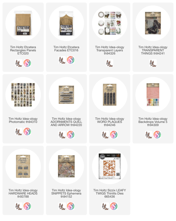
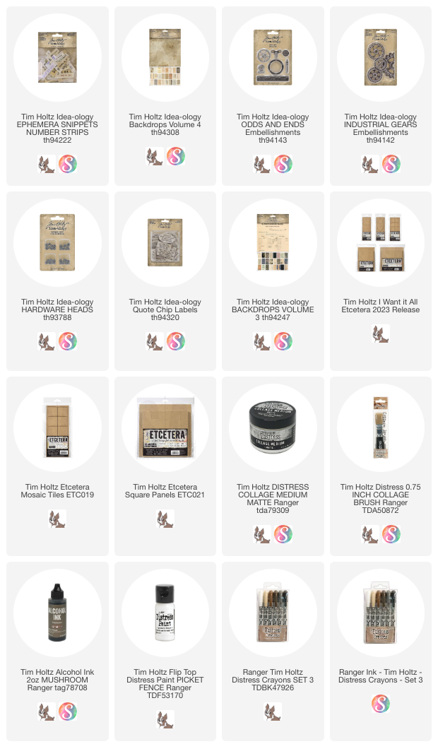
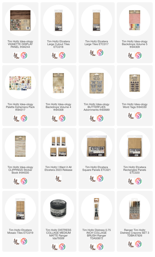
The entire box was covered inside and out with Backdrops Volume 5. I used blue and cream for the front, then added aqua, purple and pink to cover the back. It takes time to cover any Vignette Box with paper so I alway measure, cut and glue (Collage Medium) on day one. Then I walk away and come back to the filling the box. For me, it feels good to come back into the workroom the next day with the box ready to go.
My paper choice led me to the blue color scheme that runs through each compartment. The shade of blue varies for interest, but blue and cream are dominate throughout. I chose a black Design Tape with numbers for the lip edge of the box. You could use multiple tape designs if you wish but I liked the continuity of just one design.
On the back you might notice that I mixed in two Collage Strips.
The pink strip on the left and the group of neutral pieces on the far right side. You can tell it's a Collage Strip because of the scale of the images. I think they work really well with the larger Backdrop images.
When working on this box, I knew I was going to need multiple Corked Vials to fill the space, so I created all the bottles at the beginning. Then when the box was ready to fill, I could just use the ones that fit the space the best.
CORKED VIALS
1. coat with a base of Collage Medium - let dry.
2. coat with Crackle Paint- translucent - let dry
3. drip or pounce Alcohol Ink over the bottle (do not soak or your crackle finish might lift). I used Mushroom, Moss and Bottle Alcohol Ink to color the glass.
4. don't forget the cork - paint it or rub Alcohol ink on it, maybe add a Hitch Fastener, pick at the cork so it's not perfect, etc. Mine are all different.
5. add string or wire around the neck of the bottle.
Now back to the large compartment...
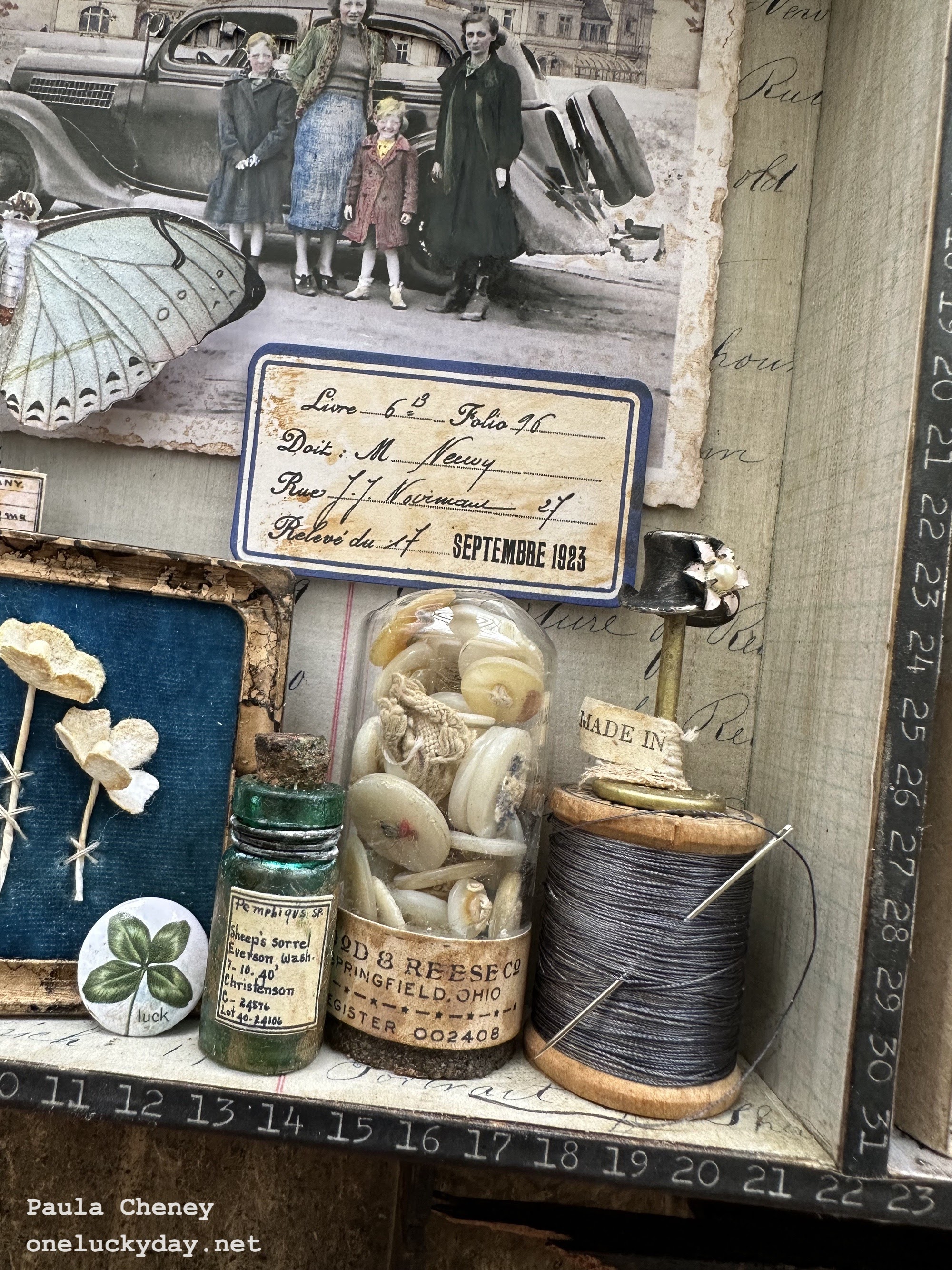
The entire piece started with this photo from Snapshots 2.
1. I pounced Gathered Twigs Distress Ink on my glass mat then sprayed it with water to created droplets. I pressed the Snapshot into the ink repeatedly (drying the ink in between) until I had an aged look to the photo. This method only works on a slick surface if you press, then dry, then press, then dry. Somehow the ink fuses to the surface enough to create the aged look. I used this same method on the blue label that sits below the Snapshot on the right.
2. Tint the Snapshot photo with Distress Crayons and a cotton swab. To get the textured look on the skirt and red coat, I tinted the skirt and coat with darker colors. Then I pressed a piece of paper towel over the top (do not rub). The paper towel pulls enough of the dark crayon away, making the clothes appear to have the texture worn away.
3. If you look closely, you can see that I also used a cutting knife to cut around the top of the car and along the top of the frame. I also cut out the windows of the car so you are able to see through.
4. I added thin foam squares to the frame, then added a 'scene' of a house that can be found in the Ephemera Palette Pack.
5. Once the photo is ready, it can be mounted on foam squares and added to the back of the tray,
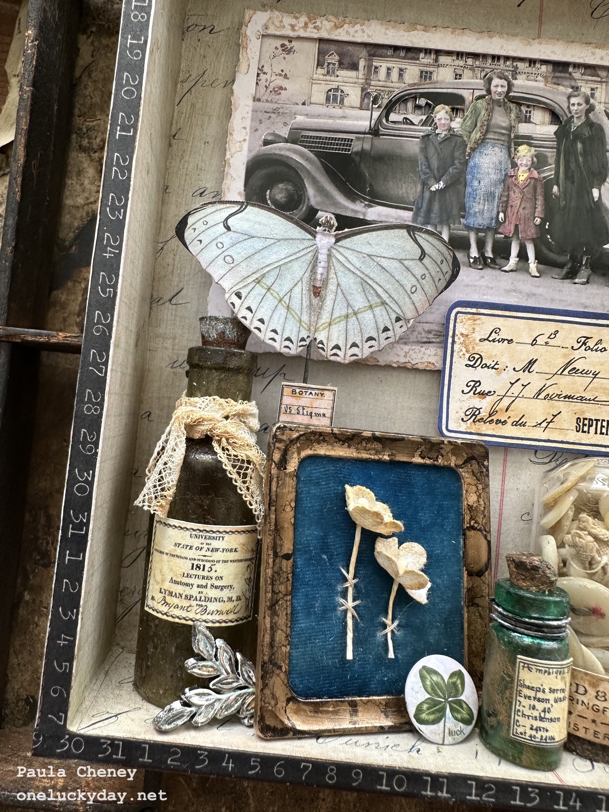
The bottom of the large compartment can be filled with anything you have on hand. A little vintage is a must. Here is a list of what I've added:
from left to right:
+ Corked Vial with ephemera label and vintage lace.
+ Foliage Adornment - white paint added
+ Photo Frame - Foundry Wax + Mushroom Alcohol ink. I cut a piece of chipboard for the center of the frame. Then covered the chipboard with a piece of vintage velvet. I used Scor-tape to add the velvet so I could still stitch through the velvet to add the Bouquet flowers. As you can see, it just added three stitches to hold the flowers in place. There was no glue involved.
+ Mini Flair with 4 leaf clover
+ Second bottle with snippet label (Curator pack) and wire around the neck
+ Corked Dome filled with vintage buttons (I collect buttons that have been used and still have the sewing thread in place).
+ vintage spool of silk thread with added threaded needle.
+ Figure Stand - I painted the top hat black and added the metal flower that I cut from a vintage earring. I LOVE the new Figure Stands so much! Tim's idea to have interchangeable pieces (the other pieces are a pointing finger and star) on a stick is just brilliant. They are the perfect miniature size.
The figures are double sided, so for instance, the pointing finger can face either left or right.
The MADE IN paper is vintage. It was on a bunch of vintage flowers and I removed it to use here.
If you are wondering how I made the Butterfly stand up in the background, it's very simple. I cut a sturdy wire and hot glued the butterfly to the end. On the other end I added a cork (larger end down) which gave me something to glue to the bottom of the box.
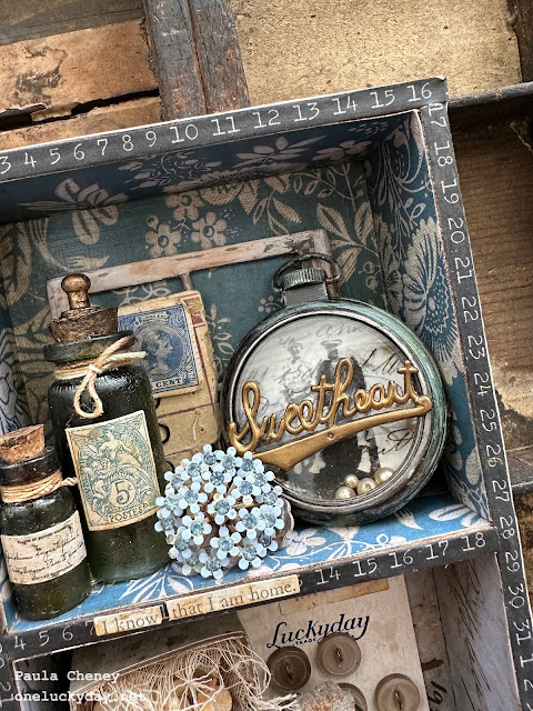
The top right compartment has blue paper so I tried to use more cream items. Cream in the labels I chose for the two bottles, the Baseboard window frame in the background, and the Collage Paper I used inside the large Pocket Watch.
The word Sweetheart is vintage, as well as the blue flower cluster (a vintage earring I have had for years). You can see I added the Hitch Fastener to the top of the Corked Vial to make it look like a stopper of some sort. I painted the metal and the cork with metallic paint so the two pieces look like they are one. The blue stamp in the background is from the ephemera pack and I just stapled it to a vintage card of hook and eyes.
I added the phrase, "I know that I am home" from the Clippings sticker book.
In the bottom compartment, you will find a Matchbox filled with more Bouquet Flowers (
Antique Linen Distress Spray was used for color). The metal embellishment with the French feel, is from the Ornate Embellishments pack. The words are, again, from the Clippings Sticker book.

I added a Word Tag to the neck of the bottle and a snippet label (I LOVE the Curator pack of tiny labels).
To make the ball of string, I just started with one of the larger Bubbles left over from a Halloween project...winding and winding till I had a ball of string. I stuck two tiny Sequin Pins into the ball like they were knitting needles.
The vintage button card with added ephemera was added to the background.
And that is it.
Creating all the bottles at the same time made the work seem easier, since it really is messy when you are coloring with Alcohol Ink and paint, and inked string, and wire, etc. Once that's all done, you can clean up and then come back to assembling.
Three cheers for idea-ology...I love the kooky, creative thought process to make things come together!
now carry on,
paula

 Cover the Etcetera Panel with Backdrop paper - this paper is from Backdrops Volume 5.
 I added Design Tape Trims to the edges of the panel.
 I squeezed some Stickles out onto the craft sheet, then picked some up with my fingertip and pressed it onto the transparency to dry. Its hard to take photos of glitter, so trust me it looks better that it does here!
 So here is how I put all the pieces together...


 Tape the 2nd transparency to the FRONT of the house Facade.
 Add Collage Medium to the back of the cut piece.
 Then flip over and place on top of the Facade, covering the tape. Press down till smooth and flat.