I found a bit of time here and there this week to crack open my new art journal
Ms Reaveley gave me at CHA. The Creative Journal is small in size, 5 x 8"...a great size for those of us who might be apprehensive about art journaling (
me) or want something that can fit in a tote or purse.
The name implies that as I can use it for anything I want.
I like that.
Mine will be used for creative play rather than amazing art or pouring out my feelings onto paper (
I like to keep my private stuff, private if you know what I mean).
I also find it very hard to photograph as I work so I don't usually share what I'm doing. It's more about just being creative and trying new things, taking risks, not having to think too much and moving really fast (no stopping to take pictures, worry about product, etc). And the most freeing...not having to worry if anyone is going to like it, other than myself.
Today I decided to create a card using some of the techniques I tested in the journal.
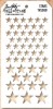
Same products...like Wendy Vecchi's Translucent Embossing Paste and stencils, Distress Stain and Markers. The art journal page was first painted with gesso, then colored with Distress Stain. The stars were created with a Layering Stencil (stars) and the embossing paste. Once dry, the color from the page shows through the stars. Love that subtle texture.
So on to the card.
I cut a piece of white cardstock 5" x 5" and coated it in Studio Gesso. I used a dry brush (no water added) so the thick Gesso would give some fine texture over the cardstock. Hard to see in the picture but you can see it in the final photos. Set the card aside till it is dry to the touch, maybe 20 minutes depending on how thick the layer of gesso is.
side note: I guess maybe I should say here that I chose to coat the
paper with gesso so the remaining layers will sit on top of the paper
and not soak into it, just like I did on the art journal page.
Next, I squeezed out a small amount of Mustard Seed Distress Stain onto a my craft mat, added a bit of water, then laid the cardstock into the stain. Pick it up quickly and dry with a Heat it tool. At this stage I go back and forth between the Heat it tool and dabbing with a paper towel. Remember, because the paper is coated in gesso the dry time is extended so you have more time to work the Distress Stain.
side note: I did not photograph it but I added Tumbled glass Distress Stain using the same method and the Mustard seed. Just remember, when adding blue with yellow you get green, so I kept the two colors on a limited "get to know you" basis. I think of it this way...they are more like brother and sister, not husband and wife.
Okay, on to the next layer...Distress Paint.
Enter a Stencil set from
Wendy Vecchi called, 3 Flouirshes. I used the blending tool to add the paint over the stencil in just a couple places. One thing I really like about this stencil is that the flourishes are in 3 sizes, which means I could use the large size in the art journal and the small size on the 5 x 5" card front I'm making. Great when a product can do more than one thing, right?
I had stars in the art journal so I definitely need some stars here. Again, Translucent Embossing Paste over the colored background.
side note: remember to wash the embossing paste off your stencil before moving on to the next step.
I decided to change it up a bit here and add some Distress Glitter in Pumice stone. What I didn't show you here is that I dried the embossing paste with my heat it tool so that the glitter would not stick to the entire star. Now I know that might sound a bit kooky but I really wanted the color of
the paper to show through parts of the stars and have Distress Glitter as an
accent (
you can see what I mean better in the next photo, once I knocked off the rest of the excess glitter).
See? some color, some glitter, just what I was looking for. Distressed.
I cut a piece of blue cardstock with a 1/2" border for the card foundation while the stars were drying. When the stars were completely dry, I stitched the card front to the foundation.
I used Tissue Tape in the art journal but wanted more of a focal point on the card. So why not use Tissue Wrap? I can find a larger butterfly and it's still the thin tissue material that will work well for an easy little trick.
First, roughly color the butterfly with a Distress Marker (
broken china), dragging the color out to the ends of the wings with a water brush to create some transparency in the tissue.
side note: It is easier to color the butterfly and then cut it out.
Flip it over and add a layer of multi-medium to the back.
Lay the butterfly onto the card front and lightly press into place. As you can see, the yellow from the background comes through the tissue and enhances the butterfly color. Good trick, and so very easy.
side note: I cut the left wing of the butterfly off, BEFORE I added the multi-medium to the back of the butterfly.
Use a Distress marker-Pumice Stone/water brush to add a drop shadow around the butterfly. Usually this technique works best on watercolor paper, however our paper is coated with gesso, leaving an longer open time to work the color around the edge.
Let's add some words.
I gathered a few things, Distress Paint in Weathered Wood and Bundled Sage, Wendy Vecchi stencil - Barcodes, some washi tape and a blending tool with foam.
I used the washi tape to mask off the barcodes since I just wanted the word priceless.
I positioned the stencil over my card to add the word, using two layers of color, first Bundled Sage then Weathered Wood. Something about these two colors together makes for beautiful depth of color.
I also added more of the pumice stone distress marker on the edges, over the sewing thread, rubbing it into the texture with my finger tip.
I love the finished outcome of the translated art journal page. Who knew what a little experimentation could do?
"taking RISKS...not quite knowing what you're doing...
what you will DISCOVER will be wonderful"
Take a RISK, try something new! Get out that product sitting on the shelf (but never unscrewed the lid), pull out that sewing machine, dive into some paint. Today's the day!
carry on,
paula


Beautiful card. Love the muted colors. I think I need some of that translucent embossing paste!
ReplyDeleteBeautiful! I love how the color comes through the stars.
ReplyDeleteStunning card! Love all the colors and layers.
ReplyDeleteAbsolutely. Gorgeous.
ReplyDeleteAbsolutely. Gorgeous.
ReplyDeleteI love all the layers, the colors you've used, the stars, the words, the stencils!!!!!!!!!!!! Every details is absolutely stunning! Love your work!!!!!!! BArbarayaya
ReplyDeleteOh WOW!! Absolutely love it!!
ReplyDeleteI haven't used that paste yet, but think I'll have to try it, what a good idea! Thank you for such a lovely fun blog, and for your explanations of how you put it together! Jani Howe
ReplyDeleteBeautiful! Thanks for the trick with the tissue butterfly.
ReplyDeleteIt is gorgeous Paula! Lots of fun techniques. I am looking forward to trying out the clear paste. Love the colours you used and all the different textures.
ReplyDeleteLove seeing your play!! TFS
ReplyDeleteHow fun! I love seeing your techniques. Very cool!
ReplyDeleteLove the artsy feel to this card - that clear embossing paste is a must-have!
ReplyDeleteThe layers are wonderful. Some people are just born to take risks!
ReplyDeleteSimply fabulous. I love how your experiment in your journal turned into such a pretty card.
ReplyDeletePaula, I always love your projects! Would you blog a little, please, about the sewing? Do you use a specific size stitch or a certain type of thread? Do you have to adjust the tension to something special because you are sewing through paper? Thanks.
ReplyDeleteWow! What a fantastic, Creative Journal, two-page spread! The colors, layers, stenciling, stamping, glittered, raised stars ... love it! THANKS for sharing these wonderful pages and the encouragement. :)
ReplyDeletePaula, this is so beautiful, I love the colours, the texture, just everything xx
ReplyDeleteKaz x
Love, love the colors ! laughed at the description of blending colors. The texture paste is now on my "need" list.
ReplyDeletea wow card
ReplyDeletea wow card
ReplyDeleteStunning card and great tutorial! Very inspiring! Thanx
ReplyDeleteStunning is the word of the day. This is wonderful and the colors are magic. Thanks for the step-by-step.
ReplyDeleteThis is fabulous!!!!!!!!!!!!!
ReplyDeleteSo appreciate you explaining how you transitioned from the journal page to a card ... the results of both are so soft and beautiful, so appealing. Thank you!
ReplyDeleteThank you for the inspiration! So gorgeous!
ReplyDeleteGreat card Paula, will have to remember the "get to know you" theory. Good way to explain it. Love the butterfly from the tissue paper.
ReplyDeleteFabulous page! Love your step out, and those stars are amazing!
ReplyDelete