Hi Everyone...So much fun stuff going on this week! New
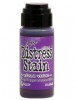
Christmas idea-ology product was announced on Wednesday. Then the new Distress color of the month,
Wilted Violet was announced yesterday. And today we're celebrating
STAMPtember with Simon Says Stamp! If you haven't heard of STAMPtember, it is an event intended to inspire, educate, and celebrate the greatness of rubber stamping! I couldn't be happier!
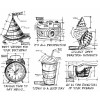
Today Simon is introducing a Tim Holtz exclusive stamp set! Blueprint stamps with built in sentiments!
Maybe I should have titled my post 1 stamp 3 ways since I decided to show three different takes using the birthday hat image.
I used the Distress Watercolor paper + Snowflakes Texture Fade to create the textured background. Super easy to color the heavy Watercolor paper using Distress Spray Stain + water. Once dry, I cut out the center using the Sizes
Ovals to
create a frame.
The image was stamped and embossed twice with Ranger gold embossing powder. The second embossed image was cut out and colored with Distress Markers and a Ranger Detailer Waterbrush.
I used foam squares to pop up the image.
The second card is a simple to make, yet it has great impact because of the bright color, including the NEW Wilted Violet!
I used the Wrinkle Free Distress technique to color the Distress Watercolor cardstock using Ripe Persimmon, Wilted Violet (
yep, that's the real thing!), and Twisted Citron. Wilted Violet is a great color combo with Twisted Citron!
I added a couple wishbones to a jump ring and a flag. The word friend came from the Remnant Rubs.
For the third card, I decided to change it up by stamping on a transparency with Staz-On ink.
Then I used Alcohol Ink in Raspberry and Lemonade to color the image, giving it a watercolor effect. To prevent smearing the black ink, I used a slender paintbrush to do the coloring. If you want to avoid that, then just color the backside of the image. I wanted the pooling of the ink to give it that watercolor look though. (
btw, you can clean your brush with old fashion rubbing alcohol).
I created a card with Fossilized Amber, Mermaid Lagoon and Worn Lipstick, then stamped it with my favorite polka dot background stamp.
Both the card and the transparency were slipped into a Cabinet Card, then a strip of Industrious stickers was added across the bottom.
I made a colorful bow with Abandoned Coral (
seriously have I used every color of the rainbow on this card?) and added it to the top of a #8 tag, which I slipped into the back Cabinet Card for a handwritten sentiment. The Typed Token tops it off.
I sure hope you have enjoyed, "one stamp, three ways"! There are 5 other great images on this set to work with, so I can only imaging the amount of great ideas we will be seeing today!
now carry on,
paula


How cool is the last card? You mentioned staying away from the black ink. Is that so that the ink doesn't blur? If so, why couldn't you paint on the backside of the transparency? I think that would give the image a totally different look.
ReplyDeleteHi Dodie, yes I could have colored the image on the back but I actually wanted the watercolor look.
DeleteOh so awesome Paula!! TFS
ReplyDeleteall your cards are absolutely amazing and so beautiful, thanks for sharing!
ReplyDeletesuch HAPPY cards! thanks
ReplyDeleteWhat a great idea Paula! Thank you for inspiring us through your art and clever ideas! <3 Thank you for celebrating STAMPtember® with us too!
ReplyDeleteOh my word Paula! Love all your cards, and am amazed at the impact of the second one with such a simple technique, thanks for sharing your talent!
ReplyDeleteLove that you show what each of the Distress products can do.
ReplyDeleteFabulous cards!! So many super sweet deatils !! Thanks for the inspiration!
ReplyDeleteAwesome cards and the Last one is my Favorite !
ReplyDeleteColor galore! All of your cards are amazing Paula. How lucky are you to have the wilted violet to play with?
ReplyDeletethat wilted violet is so pretty.
ReplyDeleteAwesome creations!!!! I especially love the last one in the oval Cabinet Card!
ReplyDeleteFabulous cards Paula :-) 3 different but all equally fabulous techniques! LOVE them :-)
ReplyDeleteuv
Lols x x x
What a nice little tutorial and I love the purple fard especially
ReplyDeleteWhat a nice little tutorial and I love the purple fard especially
ReplyDeleteI need to explore the wrinkle free distress technique, love it with the new violet!!!
ReplyDeleteReally fabulous watercolor work here, lovely cards!!!
ReplyDeleteWow! All three are fabulous and I love the new stamp set, plus the new distress violet color.
ReplyDeleteBeautiful cards - love each one especially the last card. You have made it look so easy to create; the design and vibrant colors you have used are perfect:)Thank you for the inspiration:)
ReplyDeleteYour cards are simply beautiful. Love the embossed one. Makes a great card. I also love the colors on the second one. Isn't the Wilted Violet lovely. The third with the muted colors is fabulous. Thanks for sharing.
ReplyDeleteWonderful cards.
ReplyDeleteFantastic cards!! All sooo different!!
ReplyDeleteOh Paula you make me so giddy when I see your work ( I think in my head ... "I'm gonna be like her when I grow up " ). Those cards are gorgeous !! The color combos are fabulous. My favorite is the one with the wilted violet ... Royalty you know ...
ReplyDeleteI like how you showed what each product can do and each of your cards are outstanding. The party hat that you used the wilted violet distress stain is outstanding. The color really pops. Thanks for sharing.
ReplyDeleteLinda D.
Beautiful cards Paula!! What a great idea to show three different ways of using the hat stamp. All three cards are wonderful.
ReplyDeletebeautiful colorful work
ReplyDeleteGosh these are great! Don't see you making cards too often and it just goes to show the many talents you have. Impossible to pick a favorite, love them all!
ReplyDeleteI love all the cards, but the last one is so vibrant in colors, such a clever way you have used to color it
ReplyDeleteLove the cards. The transparency one is very neat.
ReplyDeleteHi, Paula, love your gorgeous cards! The colors and the texture are awesome! :)
ReplyDeleteLove your cards. I'm in awe of your sewing and that bow at the bottom of the stitched... LOVE! The alcohol ink painted acetate is awesome. Thanks for sharing. :)
ReplyDeleteWhat pretty b'day cards you created with this fun new stamp Paula - love all the techniques you used - thanks for sharing just how you made these! Julia xx
ReplyDeleteI love these!
ReplyDeleteGreat cards. Thanks for sharing the details. At first glance they look really simple, but there are a few steps. Enjoyed looking...
ReplyDeleteWhat fun cards...love the new Wilted Violet....think that will become my new fav...
ReplyDeleteThese are stunning, Paula! I so thoroughly enjoyed this post and loved seeing how many ways you were able to unleash your geniusness with the same image! Amazing work, as usual!
ReplyDeleteGreat techniques and fantastic cards! Love your style!
ReplyDeleteI love your first card! Such an unexpected technique with the Tim Holtz stamp!
ReplyDeleteI love your first card! Such an unexpected technique with the Tim Holtz stamp!
ReplyDeleteVery nice card! Thanks for sharing!
ReplyDeleteLoving these! I think my fave is the first card, I really like the subtle stitched frame and that little bow... it's got such an impact for something so delicate!
ReplyDeleteLove your cards!
ReplyDeleteFABULOUS stamps and AWESOME cards!!!
ReplyDeleteTHANK YOU for sharing your CREATIVE INSPIRATION!!!
Such beautiful cards! Love all of the gorgeous colors you used on them!
ReplyDeletesuch gorgeous cards I love all the colors thanks for sharing
ReplyDeleteBarb Housner
Lovely cards.
ReplyDeleteGreat cards and techniques. My favorite is the first one. Love the colors and for some reason I never thought of gold on a blueprint stamp. Now I know how beautiful it is. Thank you.
ReplyDeleteI am always amazed at what you come up with Paula. You already have me in love with Wilted Violet, and I love the party hat embossed in gold..so pretty!
ReplyDeleteFantastic work! All the techniques you applied to your cards are amazing! TFS. I’m loving these Stamptember posts but it’s making it hard to choose which sets to buy! Ugh! I want them allllllllll!!! LOL
ReplyDeleteLa-Vie B.
Follow me at C’est La-Vie Designs Unlimited, LLC
Beautiful cards! Very inspiring!
ReplyDeleteBeautiful cards. Love the various color combinations.
ReplyDeleteVery pretty cards and pretty colors!!
ReplyDeleteFabulous cards! Love the creativity you poured into them.
ReplyDeleteThey are all nice cards but the birthday one is my favorite. I never imagined an elegant gorgeous card from this stamp - but it is. WOW
ReplyDeleteI don't know about every color of the rainbow, but I think you used all the 2015 colors, Paula! Good to see how nicely they play together. Love all three cards and now you've inspired me to do something with transparency.
ReplyDeleteBeautiful cards, can't wait to get the Wilted Violet!
ReplyDeleteSo very cool! I really haven't purchased any distress stains but that first card makes me want to get some. I love it!
ReplyDeleteWOWZER!! You're making me crazy jealous with all those beautiful cards!! Beautiful inking!!!
ReplyDeleteGreat cards Paula. Don' t you just love Tim Holtz's products. Always something new & great!
ReplyDeleteBeautiful cards! I love that new Wilted Violet color!
ReplyDeletePaula these cards is so absolutely wonderful! three stunning interpretaion! It's impossible pick one! Fabulous as always! Barbarayaya
ReplyDeleteWhat a great set of cards...loved each one of the....the background on the 2nd one is just fab!!!
ReplyDeleteBeautiful, as usual! I love the backgrounds you created, and you give great instructions.
ReplyDeleteWonderful cards Paula and you have showcased the versatility of this great new stamp perfectly. They are all gorgeous but I particularly love the second card, the Wilted Violet and Twisted Citron colour combo is fabulous and love the addition of the wishbones! Deb xo
ReplyDeleteAll different looks and they all look great! Thanks for sharing several ways to create with the same stamp.
ReplyDeleteThose are awewome! Thanks for some great inspiration!
ReplyDeleteThese are wonderful cards using these fun stamps, your work is always an inspiration. :)
ReplyDeleteThat last card is a keeper! Love those stamps!
ReplyDeleteAWESOME creation!
ReplyDeleteThose cards are awesome. I love the stamping on transparency idea! TFS.
ReplyDeleteWhat is the difference between using the alcohol stain and the alcohol ink? Do you like it better? I have been wondering this for awhile and just have not used the stains yet. Thank you for sharing your beautiful work with us.
ReplyDeleteLoved the Halloween makes in the later posts, and this gentle rainbow of colours is so charming - a delight.
ReplyDeleteAlison x