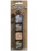
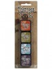
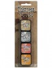
A nice little package was delivered to my door a few days ago. They say good things come in small packages right? I'm happy to announce that 3 more sets of Distress Ink Mini's have been released by Ranger and will begin shipping today. Here is a look at the sets being released.
I thought creating a monoprint of each set would show you how the colors in each set look together. So good, right?
But then again, look at set #8.
Set #9 is a little muted...but still great for something masculine or the fall season that will be upon us in just a few short months!
Something I have started doing is writing the set # in Sharpie marker on the bottom of each pad. The Distress Inks are totally mix and match of course, but I like the thought of knowing what combinations Tim put together. Seems the colors always work together perfectly and when I need a quick pre-made combination...I can just look at the bottom and know they will work together.
I had an idea to make a card using the new Layered Butterfly. This comes as a set, the Bigz steel rule die to cut the butterfly and the texture fade to make the impression.
First, I cut the butterfly out of Ranger
Watercolor paper using the Bigz die.
Move the cut piece into the texture fade, matching up the lines.
Send the Texture Fade through the Vagabond or Big Shot to get the detailed impression. Simple and easy!
Before I get started, I want to warn you that you have to stick with me till the end. It's one of those techniques that goes through a bit of ugly before it gets better.
I'm using set #7 that has Old Paper, Worn Lipstick, Wild Honey and Weathered Wood. I used a Mini Distress Tool to rub Old Paper Distress ink over the raised portion of the butterfly. If you get the ink into the recessed part, it's not a problem, just keep going.
Pounce each of the 3 remaining colors onto your Craft sheet. Use a detail waterbrush to pick up each color (one at a time) and add to the butterfly.
I know, this is the part where I'm going to loose half of you because your thinking, Paula, that looks like a 5 year old did the paint job. Well, in this technique, it just doesn't matter.
The goal is to color the recessed areas of the butterfly. If the colors get on the raised area it is not a problem...just keep moving.
Use a Mini Blending Tool to add Vintage Photo to the edges of the butterfly (I know, it still doesn't look any better).
Here is where it gets good....Use your finger to spread a layer of Distress Crackle Paint (clear rock candy) over the entire butterfly. I put it on kinda thick with at least enough to fill the recessed parts of the butterfly.
The hardest part is to set it aside and let it dry.
After about 30 minutes I can see the crackle start to happen....just another 30 minutes or so.
While the Crackle is drying, cut a card backing.
I cut a 6 x 12" piece of turquoise Core'dinations cardstock. I folded the left side towards the center 4 1/4" and the right side toward the center 2" (
you will see this in a later step).
I also cut a piece of patterned paper to go on the front of the card from the 8 x 8" mini Stash - Menagerie. I inked the edges with Weathered Wood.
Then (you know me), spritzed it with water and crumpled it up into a ball.
I unfolded it, ripped some of the edges (
on purpose), dried it with a heat tool and inked it a bit more.
I wanted a bit of a sheen, so I sprayed it with Heirloom Gold Perfect Pearls Mists.
Once dry, I stitched it to the card front. I gave myself quite of bit of leeway on the sewing so I would have plenty of paper to bend and fold over.
I need some ribbon...again using the same colors as the butterfly - I pounced on some color from the ink pads, spritzed the ink with water and then laid two pieces of Crinkle Ribbon in the wet ink (16" + 23").
Just keep turning and sopping up the ink. Keep a good watch on the ink so the 3 colors don't become muddy. If at any point you think it might be heading that direction. Stop. Dry your ribbon. Add more ink/water to the craft mat and start a new layer over the dried one.
Once dry, the colors are very subtle. Probably one of my favorite combinations of colors.
I tied the 16" ribbon around the card and tied a knot.
Wind the 23" piece around your fingers in a loop till you run out of ribbon.
Pull the ribbon from your fingers (pinching in the middle), then secure the loops with the two ends of the 16" ribbon. (you can see step-outs
here).
Okay, so now I'm ready for the butterfly!
And after an hour or so depending on how thick the Crackle paint, I have this. Can you see that any missteps in the waterbrush/painting portion is corrected by the Distress Crackle paint?
I added the butterfly to the card front - just adding thin foam tape to the center for now.
Once the butterfly was on the card, I decided I wanted to give it a more vintage look, so I rubbed Vintage Photo Distress Ink over the top of the crackle. This step is totally a matter of taste. You can always be done at the previous step and leave the butterfly nice and shiny.
I also wanted to add some Sizzix Frameworks in the honeycomb shape. I cut a couple pieces, then colored them with 2 coats of Distress Paint in Tarnished Brass.
I added small bits of Scotch Foam Tape to the back in preparation of adding it to the card front.
I also prepared a flag that I stamped with the Stamper Anonymous Hashtags stamp set. I inked and sanded the cardstock, then poked a hole for a Mini Fastener.
I also created a simple embellishment to pin into the Crinkle ribbon (wire pin, jump ring and heart charm).
Add the Frameworks, flag and pin to the card front. Once the Frameworks is on the card you can adhere the butterfly wing to the left side of the card.
And there you go.
I love how the butterfly turned out.
Love the vintage look of the crackle over the Distress Ink (I told you that bad painting job wouldn't matter!)
GIVEAWAY
In honor of the new release colors, Ranger also sent me an extra set of each to give away. I'm going to split up the sets, so there are 3 winners (one set each). If you are interested in winning a set of the new Mini Distress Inks just leave me a comment and tell me if you have a favorite combination.
Be sure to check back on Thursday morning (19th) to see who won! Good Luck everyone.
now carry on,
paula


Stunning card and great examples of the new sets. Thanks for all of the detail!
ReplyDeleteI love your 5 year old colored butterfly. That die has been on my list since Day 1!!
ReplyDeleteSet #7 would have to be my favourite colours. But truly anything you create Paula is always gorgeous.
ReplyDeletethanks Sandra de, you are too kind.
DeleteYour tutorials always inspire me:0) Love your card!
ReplyDeleteThe new colors are fab!
grtz Jolanda
my favorite colors; set #8;0)
DeletePaula, your butterfly is stunning - the crackling is really wonderful. Set 8 is my fave so far - I'm a blue and purple kind of girl and Dusty Concord and Tumbled Glass are fantastic colours, so putting them together in a pack with a fab orange and green really floats my boat. You are very generous with your giveaways - thanks. Jean.x
ReplyDeleteLove the card and I love what you did with the butterfly. You are so creative. If it wasn't the middle of the night here I would try to do it right now!!! I love all the new colors, but #8 would be my favorite.
ReplyDeleteLove the tutorial Paula Thanks for the chance to win
ReplyDeleteYour butterfly is stunning, thanks for the tutorial, Cathy x
ReplyDeleteI love the butterfly. I have not used mine yet, can't wait to try it. Thanks for a chance to win.
ReplyDeletePaula, I love how you pulled this all together... that music paper is just the perfect backdrop for your fabulous butterfly... love this. The #9 set is my favorite. I'm a Frayed Burlap girl all the way and the three others are the icing on the cake... beautiful team of colors!!! Thanks for the chance to win one!
ReplyDeleteGORGEOUS! I love how that butterfly turned out, adding the crackle paint made all the difference. Frayed burlap is one of my Go-To colors.
ReplyDeletePrecioso!!!!
ReplyDeleteSo beautiful Paula!!
ReplyDeleteI have not even laid eyes on the Distress Minis yet, I am at the mercy of my local M's and it's the smallest one in NA and I guess I blinked and missed them???
They look adorable though!
DUH! forgot to add...I love all the distress inks but I love the #7 combo I think!
DeleteI think I'll have to play with the combos! TFS
This is just beautiful and I am going to be making a butterfly as soon as I can gather all the goodies you used. What is the product that you lined the word grateful on? I haven't seen one of those. I think I like set 7 but they are all welcome to come to my house!
ReplyDeleteJudy, it was just a piece of Ranger manila cardstock. I just inked it, sanded it and then bent it all up before I added it to the card.
DeleteSorry Paula, I didn't say it right! I meant the plastic that has the graph lines already on it that you placed the stamp on. I have only found them plain, with no lines. Thank you for replying. I appreciate all the help you give.
DeleteSorry about that - those are Grid Blocks that Stampers Anonymous makes for Tim. Here is the link http://www.simonsaysstamp.com/product.aspx?id=73994&c=0
DeleteThanks Paula, I am putting it on my order with the butterfly die!
DeleteBeautiful card! Of these 3 I like #7 the best. Thanks for the tutorial and the leap of faith. So excited that the bugs have been released so I can play too. Waiting impatiently . . .
ReplyDeleteOh ya, great tip on putting set number on the minis!
DeleteHi Paula... I'm torn about numbering the inks after Tim showed us in Arlington this past weekend that the foam squares fit perfectly in the bottoms of the inks. What a great place to store them. Maybe I'll keep the numbers in my journal? Thoughts?
ReplyDeleteHI Eloise, Yes, if you have a journal that would be a great place. I guess because I don't keep foam under the pad that thought never crossed my mind. Now, if I only had a journal I wouldn't misplace. sigh.
DeleteLoving these new ink sets and I love how you colored the butterfly, so pretty!
ReplyDeleteWhat a beautiful butterfly, your patience paid off. I would love to get my hands on any of these new sets, #9 is my favorite. Thanks for sharing your art Paula!
ReplyDeleteYour butterfly is awesome and I love the entire card you put together. I also love the idea of putting the set numbers on the bottom of each distress pad so you know which go together nicely. Thanks for sharing.
ReplyDeleteOh my gosh! I love this butterfly technique! New sets of mini ink pads...be still my beating heart! I think #9 is my first love followed closely by #8. But they are all so divine so all of them are just fabulous!
ReplyDeleteso beautiful butterfly!
ReplyDeleteThank you for sharing!!!!
How could a scrappy girl, Tim Holtz gal only pick one to be her favorite?!
ReplyDeleteOld Paper, weathered Wood, worn lipstick and Wild Honey - Number 8??? I'm not numbering my sets. I mix them up too much and it doesn't matter which number. Just love yummy tim distress inks
ReplyDeleteI love how you showcased these pretty colors!! I've been loving the pink and orange combination lately!
ReplyDeleteLove your card. I like the look of set #8. Thanks.
ReplyDeleteLove the technique. Great idea about numbering the sets.
ReplyDeletelove this card. the butterfly turn out beautiful. thanks for sharing
ReplyDeleteAn absolutely gorgeous card...love the tags demoing the color sets and numbering them...great idea!! Thanks!!
ReplyDeleteI love the crackle on the butterfly, looks amazing! I like the mini set with distress perssimon PLEEAASSE x
ReplyDeleteLove the examples you made: some future nice tags! And that butterfly is wonderful!
ReplyDeleteLove the project !!! I am so going to try that process. And I really like #8 - the colours are so rich.
ReplyDeleteBeautiful card, Paula. Excellent instructions. (As usual) If I had to choose my favorite set of these three, I'd choose #8. Thanks.
ReplyDeleteI'm torn between set #7 and #8. But they are all great! Thanks for the idea about labeling the bottom with the set #.
ReplyDeleteOh wow thank you for sharing this amazing technique. I am so Iove. Any set would be a blessing to win. Xxx
ReplyDeleteGorgeous card! I just love the butterfly. Thanks so much for the inspiration. I love all the Distress inks but if I had to pick a set it would be #8 with #7 close behind. Thanks for the giveaway.
ReplyDeleteTotally amazing! You have the TH thing nailed! Thank you!
ReplyDeleteSuch an awesome idea to use the crackle medium. And I love #8, but really all of them. :)
ReplyDeleteGorgeous work.
ReplyDelete#8 has 3 of my favorite colors in it. :)
Paula, as always, an absolutely gorgeous work very cool! What is your secret? Your creativity is endless and I love all your projects!!! My fav set of Mini Distress is #7 , love these colors!!! Thanks for the chance! When this wonderful butterfly will be sale???? BArbarayaya
ReplyDeleteMiss Yaya - that butterfly is being released this week I think from Sizzix. I just checked with Simon Says Stamp and they said they should have it in stock in the next week or so. Can't wait to see what you do with it!
DeleteJust beautiful, love your butterfly. It's great how well the colors in each set go together, and marking each set is an idea I must use(since I've already mixed them. Thanks
ReplyDeleteThanks for this lovely tutorial...I am truly inspired...love set #9 the best but all work beautifully.
ReplyDeletefav combo, tumbled glass, tea dye, and spun sugar
ReplyDeleteWonderful tutorial. Would love to try these minis myself.
ReplyDeleteThanks for the demo on how the colours in the sets go together, makes me want them even more!! I think the Stormy Sky set is top of my list. Thanks for the chance to win some.
ReplyDelete~Kate~
i am new to all of this, so winning anything would be great! it all seems a little overwhelming right now. i found this line of inks from youtube where i was looking up paper flowers from coffee filters. i was dying them with watered down paint, and saw someone use inks and was blown away!
ReplyDeleteThe set #7 would be my favorite of the 3 but I like them all
ReplyDeleteLove the card, the colors and the butterfly are perfect.
ReplyDelete#8 is my favorite, but they are all great! Love the crackle paint technique on the butterfly, especially how it corrects sloppy painting (one of my own specialities).
ReplyDeleteperfect - a girl after my own heart!
DeleteLove the Butterfly, I love all the distress inks, but for now I think I like # 7 best.
ReplyDeleteJust gorgeous! Yup, it looked ugly and then it was a real beauty! It's kinda like the caterpillar itself and then the gorgeous butterfly born from it? :) I LOVE SET #8. Anything orange, I am sold!
ReplyDeleteSuch a gorgeous card! I think the butterfly would also be pretty with a grouping of those big ol' flowers you showed us the other day. Maybe put them all on a big present wrapped in kraft paper. Thanks for sharing your talent and for showing how the new ink sets go together on the tags. I especially like #9, b/c I live in a house of guys :)
ReplyDeleteYour butterfly is gorgeous! LOVE IT! I love set #8. I'm pretty sure it said it wants to live at my house.
ReplyDeleteWhat a great card, love the layered butterfly and your monoprints, thanks for the inspiration!
ReplyDeleteLove, love, love your card! I learned so much from the turtorial! So many techniques to try from the butterfly to the ribbon to the background paper! Set # 7 is beautiful and so appropriate for vintage projects! The other sets are wonderful too! Can't wait to try a set out! Thanks for sharing!
ReplyDeleteToo much of excitement! Oh wow, your card is stunning, I think I might just agree with you and say that the set you used is just beautiful, and a combination that I might not ever had come up with. Thanks so much for sharing the good news! :)
ReplyDeleteI cannot wait until that butterfly arrives in the UK in July!! You have made it look even more stunning with your colours and the crackle, just love it... I like any of the combinations but if I had to choose I would go for #8. Thanks so much for the chance to win too. Anne x
ReplyDeleteI would love to win any of the color combos! I love the samples you created with the stencils and watercolor technique - another new technique to try!
ReplyDeleteI am so going to have to make a note of the sets until I can get my hands on some of these mini pads! They are all so gorgeous I cannot make up my mind which ones to get first!!!
ReplyDeleteSally
I am overwhelmed! So many great techniques. Thanks for sharing.
ReplyDeleteMy favorite set is the only one I have so far...set #1. But I loved what you did above showing how each set blends on the stencils! I really had no idea they were grouped in sets by the way they'd coordinate when used together. I'm definitely going to add the set numbers to the bottoms of mine too!
ReplyDeleteMy favorite set is #3 because I love to edge. But I think set #9 my be second love these colors. Love the butterfly! Thanks for sharing.
ReplyDeleteMy favorite is #7 ~ there is just something about those colors...
ReplyDeleteBTW ~ I thought I was the only one who would go to the trouble of putting the set #s on the covers!!
Oh Paula, this is so cool, love the butterfly and can't wait to get my hands on it, love all the techniques that you have used on the card, it is striking.
ReplyDeleteLoved how you demoed the inks and the crackle paint was simply divine on the lovely butterfly. Thank you for the tutorial!
ReplyDeleteSet #8 is my favorite - love the boldness of the purple - but I haven't gotten any of the mini sets yet as I want to compare them to the fullsized ones so that I first get sets that have colors I didn't invest in yet.
ReplyDeleteWow. I LOVED what you did with that butterfly! And thought that this phrase was HILARIOUS - "goes through a bit of ugly before it gets better." hahaha
ReplyDeleteMy favorite set so far is #7.
I do until I see another combination!
ReplyDeleteSandra ltb
LOVE your card! That's a great tip too about putting the set # on the bottom of the ink pads.
ReplyDeleteThis is gorgeous Paula!! Love what you did with the butterfly here, the inking and then crackling looks absolutely fantastic together. All those inky backgrounds look wonderful too. Thank you for sharing!
ReplyDeleteAbsolutely stunning! I love the butterfly..now I need that as well as the minis!
ReplyDeleteI love set #7..fabulous!
love this...#7 is my favorite, thanks for this opportunity!
ReplyDeleteReally enjoyed seeing the transformation of the butterfly. Just like in real life- From not so pretty to gorgeous! My favorite of the current sets is #9. I see that as my go to set for masculine cards, which I struggle with. Love the idea of putting the set numbers on the ink pads...will definitely do that to my collection of regular size pads as well. Thanks for sharing!
ReplyDeleteLu C
Just got this butterfly die and now I'm off to do some card making. Thanks for the inspiration.
ReplyDeleteGorgeous card! Thanks for the visual and tips!! Lovin' set #8!
ReplyDeleteStunning card, gorgeous butterfly. Off to see if I can find it here yet in the UK. I love your tutorials I always learn something new.
ReplyDeleteThanks so much for this tutorial! I love your butterfly!
ReplyDeleteHuts, Susanne. I love #8!
This is just beautiful! Love your butterfly. If I had to pick a favorite of this release, it would be the ones that have the ripe persimmon in the pack. Gorgeous colors!
ReplyDeleteGOOD JOB! so many examples and I adored them all. The ribbon is so pretty done this way too. Peacock:) in respect to my favorite bird. I like all these colors - the more the merrier. -con
ReplyDeleteThis is so gorgeous! my fave set (today) is #8. Love the bright colors.
ReplyDeleteLove your crackled butterfly and all your tips.
ReplyDeleteOMG this card is GORGEOUS ... great tutorial, love how you do the crumpled paper ( so fun); oh and the butterfly is amazing... I love it !! Oh Paula ... I want them ALL ... favorite ... REALLY ?? ! While I'm chasing the "Sugar Daddy"... I'm having to limit my choices or make a priority list ( that's not making me very happy... but I'm making it work for right now) ... so I guess if I had to choose for right now... I think I want #8 with the dusty concord, ripe persimmons, crushed olive and the tumbled glass ... yummy color combo ...
ReplyDeleteOh, I just love this butterfly! Actually, the whole thing is beautiful, but the butterfly is totally awesome! Wow!!
ReplyDeleteLove the butterfly gorgeous. Love all the sets. No favs. Love the color, color, colors.
ReplyDeleteAdorable card! I cannot think what my favorite would be - they are all so grand! If forced to choose - #7 wins!
ReplyDeleteThe card is stunning and I really love your tutorials- they are always so clear and easy to follow, as well as inspirational!
ReplyDeleteYour butterfly is beautiful! Love all of the color combos, but think #7 is my fave.
ReplyDeleteLove the butterfly!! Distress inks are such a wonderful medium. I don't have a favorite combination. They are all wonderful!
ReplyDeleteLove your sample tags for each set - you're so right about how they complement each other - great idea to number them.
ReplyDeleteAs for the card - it's pure genius. The butterfly looks utterly stunning - pre-crackle, with crackle, with inked crackle - every single option is beauitful! And the scrunchled music, and the ribbons...I have my butterfly on pre-order - can hardly wait til it arrives!
Brilliant tutorial, beautiful card. What a fabulous post, thank you. Couldn't pick a favourite - can see possibilities with all of them... has to be pot luck!
Alison xx
Paula, the hard is absolutely gorgeous!!!! My favorite set....ALL of them!! If I as to pick...set 7....no wait..set 8...heck...can't make up my mind...LOL
ReplyDeleteI like all of the minis. It's hard to come up with a favorite combination - I like them all! And that butterfly is beautiful! thanks for sharing.
ReplyDeleteLove the end result!! The final step of ink over the crackle is what really sells this. Thanks for the great tutorial and.... something fun to make today!
ReplyDeleteSet #7 is lovely- that Wild Honey is amazing.
That is a great idea to number the sets, I wil do that when I get them...Thanks for all your time & great ideas!
ReplyDeleteBeautiful card! Wonderful product! Thanks for the chance to win!!!
ReplyDeleteJust gorgeous Paula. Im loving set 7.... thinking that's my fave xxxx
ReplyDeleteI am in love with the butterfly....a wondrous creature you have created. Anxiously awaiting the dragonfly....
ReplyDeleteIn this group I think I'll go with the Number 7 group....can't wait to play!
Thanks for another great tutorial. The card is beautiful. I have been waiting for this die to come out. I think I would have to pick set 8 as a fav but of course I live them all. The crackle looks fantastic on the butterfly what a great technique.thanks for sharing
ReplyDeleteAwesome! LOVE the butterfly and the card! Fabulous look with the Distress Crackle Paint!!! (I even thought it looked great before that step, but that made it even better!).
ReplyDelete#8 is my favorite set!
absolutely stunning butterfly card! Love the texture with the crackle!
ReplyDeleteWow the butterfly is fabulous and what a fabulous technique. I think the #7 set is to die for - the colour combination just shouts soft vintage and I love the effect you have created with the stencil. However, they are all fabulous!
ReplyDeleteWhich color combo do I like the best, wow that is a hard question...maybe set number 9?! I absolutely love the card that you made. Beautiful work and thank you so much for showing us the steps you took! Thanks for sharing.
ReplyDeleteKatie B.
They're all great, but if I hve to choose # 7. Great ideas you've shared. Thanks!
ReplyDeleteGorgeous card Paula, as always! I absolutely love the crackled butterfly. Thanks for your inspiration.
ReplyDeleteMy favorite is set #7; I like the brighter colors.
ReplyDeletelove the card and thanks for the tutorial.Also the mini are awesome and would love a chance to win.Thanks
ReplyDeleteI love all of them! They are so amazing! I love your card too.... Heading to the craft room to play... Thanks for the inspiration!
ReplyDeleteBeautiful card, Paula!! The butterfly is stunning! I really like the #9 set and the mono print you created using that set.
ReplyDeleteI love the way you did the butterfly! I like set #7 best.
ReplyDeletePick your favorite!?! Isn't that a little like picking your favorite child? It is just wrong! But if I must (don't tell the other sets!) #9. The crackle on the butterfly is to die for!
ReplyDeleteI love the mix of set #7. And your examples of all of them are fantastic!
ReplyDeleteThe card is gorgeous! i love the details on it. Favorite combo...set 8. I love purple & green!
ReplyDeleteThank you; this card is stunning. I love the wad of ribbon on the side, and what can be said about the butterfly?! It would be difficult to choose a "favorite" combination of colours from the Distress line, but I'm leaning toward kit #9 as a go-to for inspiration. :)
ReplyDeleteYou Rocked that card!
ReplyDeleteLOL!
No pun intended!
I love how you can messy paint and it turned out absolutely gorgeous!
Thanks for sharing your method!
I have yet to get a mini, but I know they all would be a favorite!
Every step of your tutorial is so helpful and the final outcome - WOW! what can I say? I would be more than happy to have any of those sets of colour, but if I had to choose, I'd go with #8.
ReplyDeleteMy fave is the set with frayed burlap! You made a great card!
ReplyDeleteMy fave is the set with frayed burlap! You made a great card!
ReplyDeleteMy fave is the set with frayed burlap! You made a great card!
ReplyDeleteMy fave is the set with frayed burlap! You made a great card!
ReplyDeleteMy fave is the set with frayed burlap! You made a great card!
ReplyDeleteLove the NEW distress minis and it would be fantastic to have a set. I adore the card. The NEW butterfly die and embossing folder will be a favorite. Thanks for sharing. Linda from Alaska
ReplyDeleteYour butterfly is beautiful!! I keep reading as I knew you would not let me down!!
ReplyDeleteI like the distress set with wild honey and the pink♥
This is lovely, and the crackle paint on the butterfly is beautiful. I think #9 is my favourite set, and I like your tip about numbering the sets. Thanks.
ReplyDeleteYou are right - that is one ugly duckling that turned into a beautiful butterfly! I love that monoprinting also - it really showed off the great color combos - I too will have to number my minis - great tip!
ReplyDeleteSoooo beautiful!!! I completely adore the look of the crackle over the water colored distress. And how wonderfully portable would the minis be...I love using distress ink for watercolor ing, but the regular ink pads take up so much room...the minis would be just perfect!
ReplyDeleteI love all of them! The mini inker tool has been sold out at my local store for weeks! I'm on a waiting list for them to call me. I can not wait to try these new goodies from Tim. Thanks for the chance to win!
ReplyDeleteI love them all!!! I especially like #7 though. =)
ReplyDeleteI love that #7 set...especially the Old Paper. I would love to try out that crackle technique too! I think it would be so much fun to sit in your studio for the whole day learning how to do these lovely techniques!
ReplyDeleteYour card is so adorable...love it...loving these new pads...love..love...mini set#9 ..tfc
ReplyDeleteI'm loving all the sets but #7 is my current favorite.
ReplyDeleteGosh, so hard to pick just one but if I have to I would say that #8 might be my favorite. What a beautiful card, thank you for sharing!
ReplyDeleteWOW...a very popular spot; sure would love to add to my mini stash; everyone's a winner, as we have this great blog posting about T.H & techniques; TFS!
ReplyDeleteI love #8! Thanks!
ReplyDeleteWhat gorgeous colors and a stunning butterfly!
ReplyDeleteI love the butterfly!!! And I have used the heck out my frameworks die....
ReplyDeleteI love how you colour the butterfly!! I don't have any favourite colour combo.
ReplyDeleteRipe Persimmon would be my fave, but let me just say WOW!!!!
ReplyDeleteI love how you lose the number 9 to color the butterfly.that's my favorite #9
ReplyDeleteSet #8 Thank you for sharing :)
ReplyDeleteWhat a marvelous project - stuck with you all the way to the end and I am very impressed! I would love any of the inks but #7 would be my first choice - thank you!
ReplyDeleteMessy painting is my favorite! The crackle really pulls it together. Your work is always gorgeous. I think set number 7 is my favorite this go round.
ReplyDeleteYour talent never ceases to amaze me. Love the crackle glaze..nice touch. I am partial to Mini set # 7 (love all the distress inks!). Thanks for sharing your talent and the chance to win a set of Minis.
ReplyDeleteAbsolutely gorgeous! Love the colours, and the distress/crackle combo is a real winner.
ReplyDeleteLove the technique that you used to make this card with the Distress Inks on the butterfly and then the crackle medium with it. So lovely! My favorite Distress Ink set would be #7, but then all the Distress Inks are favorites! How could you choose! Thank you for sharing this and making it possible for a chance to win a set of the new minis!
ReplyDeletebeautiful card...thanks for sharing! the set with the dusty concord is my favorite in this newest release....but only because it's my all time favorite distress ink color....they are all great!
ReplyDeleteI love this so much. I want to drop everything and go make this! Love the backgrounds you made at the beginning with those inks. Yum!
ReplyDeleteHhhmmm....I think I like set #8 the best. The colors remind me of a roll of SweetTarts! A silly and fun childhood inspiration. Thank you for the chance to win!
ReplyDeleteG'Day.. Wow I lve tour card, that butterfly is so beautiful, love the crackle over the top. You are such an inspiration. I love tour work... Love the combination of set #7. Thank you for the opportunity to win a set.
ReplyDeletePaula, I love all your tutorials!! Thank you so much. My fave color combo is what you used on the butterfly, #7. No. 8 was great too.
ReplyDelete#9 is my favorite. I like those deep colors. Your embossed butterfly is very nice. I haven't seen that die in person but if I do I think I may have to pick it up.
ReplyDeleteI love #9. They remind me of fall, The best time of the year!
ReplyDeletePaula, The butterfly is beautiful as is the entire card. Can't wait to try this technique out. As far as my favorite, I would say set # 7, but really , they are all my favorites.
ReplyDeletePaula your card is stunning, your butterfly makes me want to use them more! I love all the sets but number 8 is my favorite! Thanks for the chance to win!
ReplyDeleteMy favorite set of small DI's is #7, the one with Weathered Wood. Of course I will be needing them all. Love the look of your butterfly.
ReplyDeleteOh my goodness! I love that card! It just pops! I would have to say #9 is my favorite!
ReplyDeleteI take that back it's #8 lol. Isn't it a woman's prerogative to change her mind?
DeleteI'm always drawn to the blues and greens. I'm trying to use more of the pinks and yellows, this project is perfect for that! Thanks for the inspiration!
ReplyDeleteLove the tags and cards you made, but the butterfly was the best.
ReplyDeleteLove them all! I think #7 is my favorite of these three. I love your butterfly, so gorgeous!
ReplyDeleteThe butterfly is fabulous! I'm anxious to try this technique. Hard to choose a favorite set-I'm torn between #7 and #9!
ReplyDeleteFabulous tutorial, thank you - isn't it amazing how creative the web is being able to share each other's skills........ I love the 8 set :-)
ReplyDeleteHard to pick a fav but I'll go with #7.....I'm in love with the crackle look!
ReplyDeleteBeautiful butterfly card! Crackle paint makes everything better! My favorite set color combo is #9. The other two sets seem a little bit brighter, but I still like those also! lol Thank you
ReplyDeleteThe butterfly is awesome! Thank you for sharing with us.
ReplyDeleteThe card is beautiful! Lots of techniques. I always learn things here. Any set is fine, # 9 looks useful. My regular email is uoldhag49@yahoo.com Thank you for the chance.
ReplyDeleteGreat card - cool techniques!
ReplyDeleteJan
So excited to see more mini distress inks! Your butterfly card is spectacular. I would love to win a set (#7 and #9 are my favs)
ReplyDeleteGreat project. I have always loved distress inks so much. Love the smaller size for portability. The die cuts are wonderful for the propose t's.
ReplyDeleteThanks for your inspiring tutorial! If I am one of the lucky winners, no 7 is my favorite.
ReplyDeleteI love your butterfly ...and the tutorial , too . Thank you for every picture of it .
ReplyDeleteNr. 8 and nr. 9 sets are more appealing to me ;) .
Wow these projects are just stunning!!!!!!!!!! Thank you so much Paula for once again showing us how versatile Tim's products are!!!!
ReplyDeleteI LOVE all THREE sets!!!!!!!! But my favourite would have to be set #8 - I think the colours in this set can be used on girly and boyish layouts and projects!
Thanks again for sharing!!!!!!!!!!!!
Wow, great tutorial! Everything you create is amazing! Thank you so much for the giveaway, you are so generous! My favorite combination is #7.
ReplyDeleteNot in for the giveaway, just to say hi and I love the technique on the butterfly- "permission" to make a mess and have it come out so well- score!
ReplyDeleteI need that butterfly set!!!! But I do love set #8 if I have to pick one.
ReplyDeleteGorgeous card! I love the way it is folded. Thank you for the tutorial Paula!
ReplyDelete#7 is a def. fave.
ReplyDeleteThanks for the chance to win it!
My favorite is whichever one I am looking at at the moment. They are all great
ReplyDeleteHard to pick a favorite as they are all outstanding!!! Love your butterfly!
ReplyDeleteResistance is futile!!!!…who can resist these little cuties ;-) If I am lucky enough to win a set I love the colour combination of set 8. Thanks for the chance to win Paula and for the inspiration I love that crackled butterfly.x
ReplyDeleteWOW! Love your creativity! If I had to pick, I'd go for set #7, but they are all AWESOME!
ReplyDeleteOoooooh, I love these new sets! I think #8 is my favorite, but really, they're all great! :-) xo
ReplyDeleteBeautiful technique and card
ReplyDeleteSaving this for the techniques info, I like the #8 colors.
ReplyDeleteOh Paula, your card looks so amazing! So much to love about it!! That butterfly just by itself, wow! I have it on order and so can't wait for it to reach the UK.... Love the way you have used the minis on this project, and the treatment of the music paper and the embellishing and and and, just such a fab projects and thanks so much for the chance to win one of these sets!!
ReplyDeleteWow! What a great effect the crackle has on the butterfly... love it! Especially after the added ink to distress it even more. What a wonderful card; thank you for sharing the step by step - this technique is something I want to try!
ReplyDeleteGorgeous! I can't wait to try these techniques.
ReplyDeleteI love that card! It is amazing. I need to try some for myself. I like the set #7 colors the best - great way to show the combos. Thanks for the inspiration Paula.
ReplyDeleteI always go for the masculine colors so combo #9 is my favorite. I love the ink over the crackle paint. It gives the crackle definition. Great card Paula!
ReplyDeleteI like them ALL, but I think #8 is my favorite! Love those colors together in the monoprint! thanks!
ReplyDeleteSuch a beautiful card. Currently I am loving Faded Jeans , Concord Grape and dried marigold together....with some brown of course.
ReplyDeleteOh Paula,What a delightfull butterfly!Thank you for your tutorial and for the chance to win a set of these amazing little Distress Inks.I love them all!
ReplyDelete