
Inspiration comes from everything around us, and today is no exception. I love visiting REstyle Source for amazing design ideas. Today I read an interview with the ever amazing Carol Hicks Bolton. I am sure many of you have heard of her or know of her style by sight (it's easy to spot her signature work) or maybe you were a fan of the old Home Companion magazine in which she (and her family)
were featured many times. That is how I came to know of her, and her
talented family as well as the little town of Fredricksburg, Tx.

photo: Amy Boland
The Oct/Nov 1998 issue of Home Companion was the bellwether article. It was called, "Beyond the Pale", about Rose Hicks, matriarch of the talented Hicks girls - Carol, Janet, and Cathy. Her featured home was styled with a totally different mindset to decorating with antiques. So many new ideas, dark wood furniture painted creamy white, ironstone turned backward so the marks on the back are visible, the use of books and words cut from them in display. I could not get the old 1980's tole painted stuff out of my house fast enough!
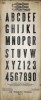
If you look closely at the picture below, you can see the snippets of type that have been cut up and pasted to the cabinet front. I do not even have to enlarge the photo because I can remember, even after all this time, it says, "you are the salt of the earth" and then has the scripture reference up above. Captivating.
Needless to say, I started buying white ironstone like mad, glass salt and pepper shakers to hang from old chandeliers, and old books to cut up.

You can see the rest of the article about Rose Hicks here.
Then, in the fall I visited Fredrickburg for the first time. Back then
there were at least 5 stores that were part of the Homestead dynasty. If I remember correctly there was Homestead (2 floors of everything under the sun, from school maps to Catholic saints), Homestead 2 (fabric with another antique store hooked on), Room No 9 (huge store with iron beds, amazing chandeliers and bedding/bathroom linens all lined up on huge wood tables),
American Higgley Piggley (sp?), a darling little house full of
ironstone (and I mean full). There was also a garden shop down a narrow
alley but I can't recall the name.
I have a very distinct memory of standing with my sister in Homestead 2 looking at a farm table that was set for dinner with mismatched white and blue ironstone. On each dinner plate was a small antique book that had been opened and a large silver serving spoon placed horizontally across the top to keep the book open. It might not sound so very innovative in 2013, but 15 years ago it was a breath of fresh air from what had been in any magazine at the time. I don't know what it was about this specific scene, but I felt differently about design when I left that store as if a whole word of off-beat ideas opened up.
 How many of us have this picture stashed somewhere? This photo, from Country Home magazine, is of Janet (Carol's sister) entry way...amazing. I love how the frames are hung with string from the pegs above and the books held open with wire screwed to the wall. Notice the subtle harlequin pattern on the wall and then the faux wallpaper over the top. What detail.
I have a very distinct memory of standing with my sister in Homestead 2 looking at a farm table that was set for dinner with mismatched white and blue ironstone. On each dinner plate was a small antique book that had been opened and a large silver serving spoon placed horizontally across the top to keep the book open. It might not sound so very innovative in 2013, but 15 years ago it was a breath of fresh air from what had been in any magazine at the time. I don't know what it was about this specific scene, but I felt differently about design when I left that store as if a whole word of off-beat ideas opened up.


photos: Country Home Magazine

I have gathered some images from the store Facebook page to share or you can check out the Antiqüités Facebook page for yourself here or even what comes up when you type her name into Pinterest. Amazing work.
I hope you enjoy!

Always little typed out scriptures tucked into small spaces.


red book covers

photo by April Pizana


photo by Anne Lorys
This vignette is my favorite, wire screwed right into the Texas limestone. Usually it's old books or ironstone turned backward being held by the wire, but here it's an inspiration board.


If you want to see more photos, here are a few more posts about the store from 2012 -
carry on,
paula


