Wednesday, March 19, 2025

Layering with Distress Crayons

Hello friends,

I want to share a technique I have been testing out this week! I had the idea to color some Distress Mixed Media Heavystock #5 tags with Distress Crayons. I've tried coloring tags with crayons in the past, but I never felt like it was a success till today. And now I can't seem to stop! 
If you'll follow along, I'll walk you through how I started and how I got to the point where I was really in love with what I was creating. 
So I started the process with three color of Crayons per tag. The only thing I used was water and crayon. I suppose you could have easily added Collage Medium to the tag before adding the crayon, but I did not. I only sprayed the tag with water.

TIPS: 
  • It's best to have your colors picked out before you start.
  • Work quickly.
  • Spray more water if the tag dries out.
  • Don't be afraid to build up the color by repeating the steps. The texture is beautiful.
  • Use your heat tool to dry between layers, even though you might spray them again.
Please be kind to yourself when practicing this technique. I made multiple tags with just 3 colors (trying different combinations) before I started adding more layers over the top. 

Now let me walk you through the easy steps:
1.  Spray tag with water (I am using Distress Mixed Media Tags which are made with a coated paper - that is very important in this technique).

2.  Working quickly, scribble crayon over tag.
3.  Use a paintbrush to move the crayon around, blending between the colors. You may need to add more water or use a wet wipe to pounce over crayon.
4. Dry with a heat tool then repeat steps 2 and 3 (add more crayon and blend again).
NOTE: When using a paintbrush, you must rinse the brush between colors or use more than one brush.
So I loved where that was going, but then I thought, what if you took it a step further and added more color on top of the first three? So that colors not only merged, but when more color is added it changes  the appearance. All I could think in my mind was a Mark Rothko painting. Colors floating over colors. 
This was my first attempt. I found that if you add a lighter color over a dark one, it works to merge the two. Funny, I don't use the lighter colors of Distress Crayons as much as the more pigmented ones, so I was happy to find a way to use them. The appearance in the photo appears a bit harsh, but in person it is smooth to the touch, almost suede like because of the build up of color.
Tag 1
first layer: tumbled glass, ripe persimmon and fossilized amber
second layer: spun sugar 
I love how Spun Sugar helps to beautifully bridge the area between the blue of tumbled glass, and the brightness of ripe persimmon!
Tag 2
milled lavender, shaded lilic, crushed olive
Lets start one from the beginning.
1.  Choose first three crayon colors.
2.  Spray tag with water.
3.  Quickly scribble colors onto tag.
4.  Immediately begin to smooth out the crayon. You may need to add more water to move the crayon.
5. Dry with a heat tool for 10-15 seconds.
NOTE: I decided to abandon the paintbrush altogether and use my fingertip to manipulate the crayon. I just wiped my fingertip clean between colors. So much easier than a repeatedly cleaning a brush.
5. Repeat the steps to add a second layer of color. This time tumbled Glass was added along with more Shaded Lilac.
6. Spray lightly with water and move the color around with your fingertip till you are satisfied.
TIP: Use a wet wipe (pouncing motion) to remove color and reveal more underneath.
Tag 3
spun sugar, saltwater taffy, mustard seed
Second Layer: picket fence and abandoned coral
(white was added first, then the coral)
Tag 4
uncharted mariner, cracked pistachio, salvaged patina

second layer: kitsch flamingo and picket fence
Tag 5
speckled egg, evergreen bough, rustic wilderness
watch this one change...
seedless preserves
and with picket fence and mustard seed
Oh my gosh, the combinations are endless! Honestly, all I used to create these were my crayons, a distress sprayer, my heat tool and a wet wipe or two! I think that is amazing.
I hope you will give this one a go, because it is so much fun seeing what you can create by layering the crayons one over the top of each other. And remember, give yourself some grace at the beginning when you are learning to layer. It takes a bit a patience, but once you get it, it's magic.

I'll be back shortly to share what I decide to do with the tags. So stayed tuned.

Now carry on!
Paula

Friday, March 14, 2025

Abandoned

Hello Friends,

I have a new project to share with you using the Tim Holtz idea-ology 2025 Limited Edition Vault Paper Release!

This limited return of six classic Tim Holtz idea-ology paper collections include: Abandoned, Correspondence, Dapper, French Industrial, Memoranda and Wallflower. These papers are available in both 12” x 12” and 8” x 8” paper packs vs. pads (meaning no gummed edges to deal with). 


You can find my project over on the Simon Says Stamp blog featuring Abandoned 12 x 12" paper. I sure hope you will follow the LINK, to see the step-out tutorial to create this piece. You can see the bold color of Abandoned in the background!


Now carry on,
paula

Tuesday, March 11, 2025

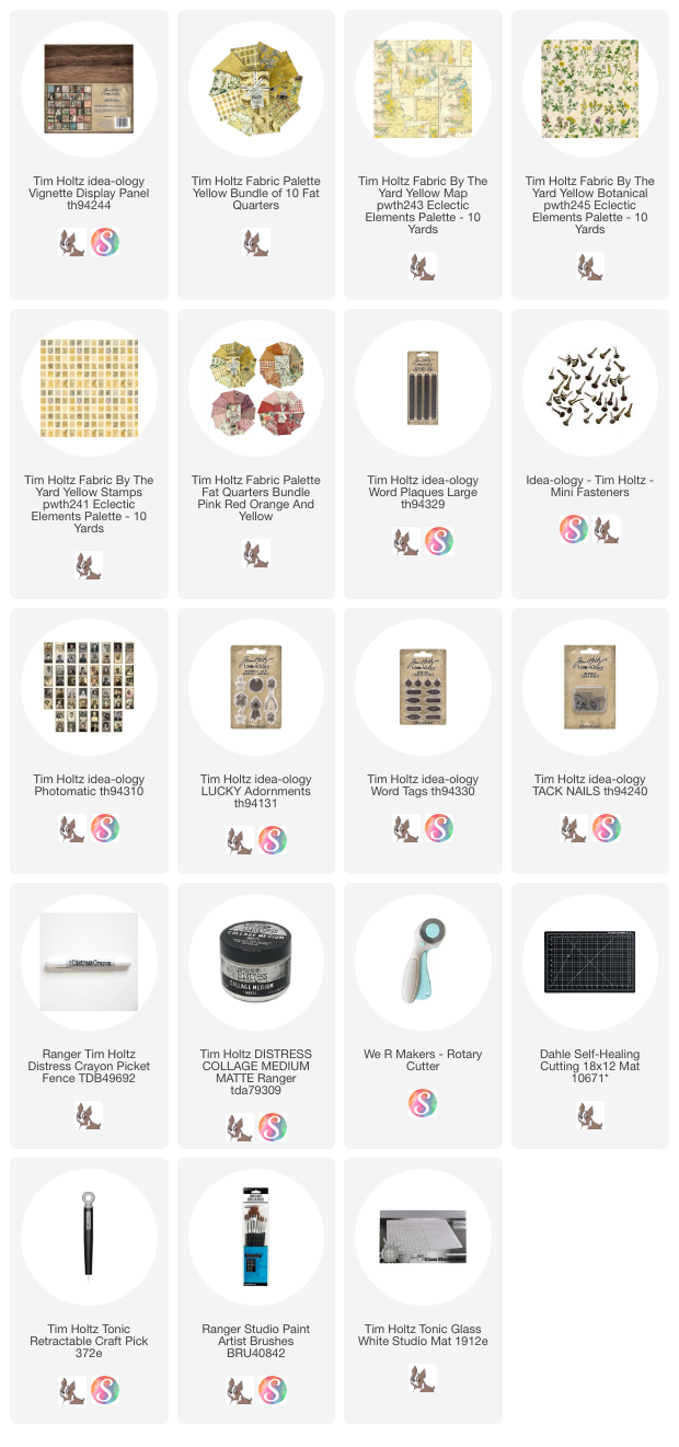
Palette Yellow

Hello friends,

I an so excited to share my Display Panel project using Freespirit Palette Yellow fabric. I like yellow, but I LOVE this fabric! It is just so beautiful! The yellow tones are so pleasing and work so well together! 
I decided to use the Yellow Map fabric for the background, along with paper from Vault Memoranda in 12 x 12" for the sides of the Display Panel (one can never go wrong with ticking).
Of course there are 10 Yellow Palette fabrics-
Yellow Botanical
Yellow Collage
Yellow Map
Yellow Numbers (lotto cards)
Yellow Specimen (butterflies)
Yellow Stamps
Yellow Tickets
Yellow Tiny
Yellow Vintage
Yellow Wallpaper


Let's get started on the Display Panel project!
I added the Memoranda Paper to the sides of the panel with Collage Medium. I also added a bit of white paint to the top of the panel in case the wood showed. 
Another idea is to cut your fabric panel smaller, say 8 1/2 x 8 1/2" and paper the top of the Display Panel so the ticking shows on the front, not just the sides.
Cut both the Yellow Map fabric and a piece of cotton batting about 10 x 10". The Display Panel is 9 x 9", but I want some leeway so I can square up my fabric after I sew these two together.
I'm going to quilt these two piece together so I am making lines with a FriXion Erasable Pen (I bought mine at Target in the office supplies section). I just used my clear quilting ruler to make the lines 1" apart.
Turn the fabric and make lines across the ones you just made (again, 1" apart).
Go to your machine and stitch following the lines.
Then to the ironing board so you can use the heat of the iron to make all the pen lines disappear. It's like magic - I swear it never gets old!
Now to the self-healing mat to square up the panel to 9 x 9".
So I want to add some patches of three other fabrics - Yellow Botanical, Yellow Stamps, and Yellow Tickets.  I found that Collage Medium is perfect to add stability to the fabric. You just paint some on the back. You don't have to over do it, just a nice even layer will do. You can either let it dry naturally or use a heat tool. I used the heat tool because I'm impatient.
Once dry, you will easily be able to cut the pieces apart (with fabric scissors or a rotary cutter).
I began by sewing patches on the left side of the panel. I knew I wanted the nails on the right, so it made sense to have the collage on the left. 
One trick Richele taught me is to use a glue stick to stick things down (like patches) before you go to the sewing machine. She uses it when she sews the first line on a zipper, so why not a patch? Well it works like a charm. 
You can see I have a empty area for my Photomatic image. We'll work on that next.
I chose one of my favorites - the lady with the hat and polka dot veil. She looked to me like someone who is on her way to the big city! I used three Distress Crayons and a few cotton swabs to tint the photo. The blue and green background was added directly then smoothed out with the cotton swab. For her cheeks, I always add Aged Mahogany to the Studio Mat, then pick it up with the cotton swab, tapping over the cheeks. I can "smooth" put the color with the clean end of the swab.
To make it look like she is riveted to the the panel, I added Mini Fasteners to each corner. Set the photo aside while we finish a few more things.
Like this long Word Plaque. I colored in the Word Plaque with Picket Fence Distress Crayon then sewed it to the quilted panel with heavy string.
I added the Photomatic with Scor-Tape. You could use the Mini fasteners or Collage Medium to add the image but I went with Scor-tape.
Now this one might be hard to see, but I added french knots to the center of the flower with dark brown embroidery floss. I love making french knots, but if that is not your jam you can skip it.
Using the same embroidery floss, I added a small clover from the LUCKY Adornments pack. I did paint it green using Rustic Wilderness Distress Paint before adding it to the panel.
Use Collage Medium to add the quilted fabric to the wood Display Panel.
Use a Picket Fence Distress Crayon to fill in a Word Tag. I used the word Found to add to the nail that will be hammered into London on the map.
I used two idea-ology Tack Nails to hold the string that represents travel from the far reaches of the world all converging on the international city of London.
I used blue sewing thread to hold the strings on the edges, rather than nails. Almost like the string can slip through the thread at any moment and that line of travel being extingushed.
I'm loving this piece. I also think it could be personalized with so many symbolic references particular to the person it was being made for. The Yellow fabric really works, but it could be done in many colors! When we get into the blue's during summer, a much more masculine one could be made with a whole different feel.
Now carry on,
paula