Saturday, June 21, 2025

Alcohol NEONS

Hello friends,

Nice to be here today because this is going to be a fun one! I am giving the new Neon Alcohol Inks from Tim Holtz and Ranger Ink a test run and I guarantee you are not going to be disappointed. The new Neons come in a pack of 8 or as individual colors. I swear, the pack of 8 is the way to go because all the color are amazing. My personal favorites are Hyper, Florescent and Radioactive and Ignite.
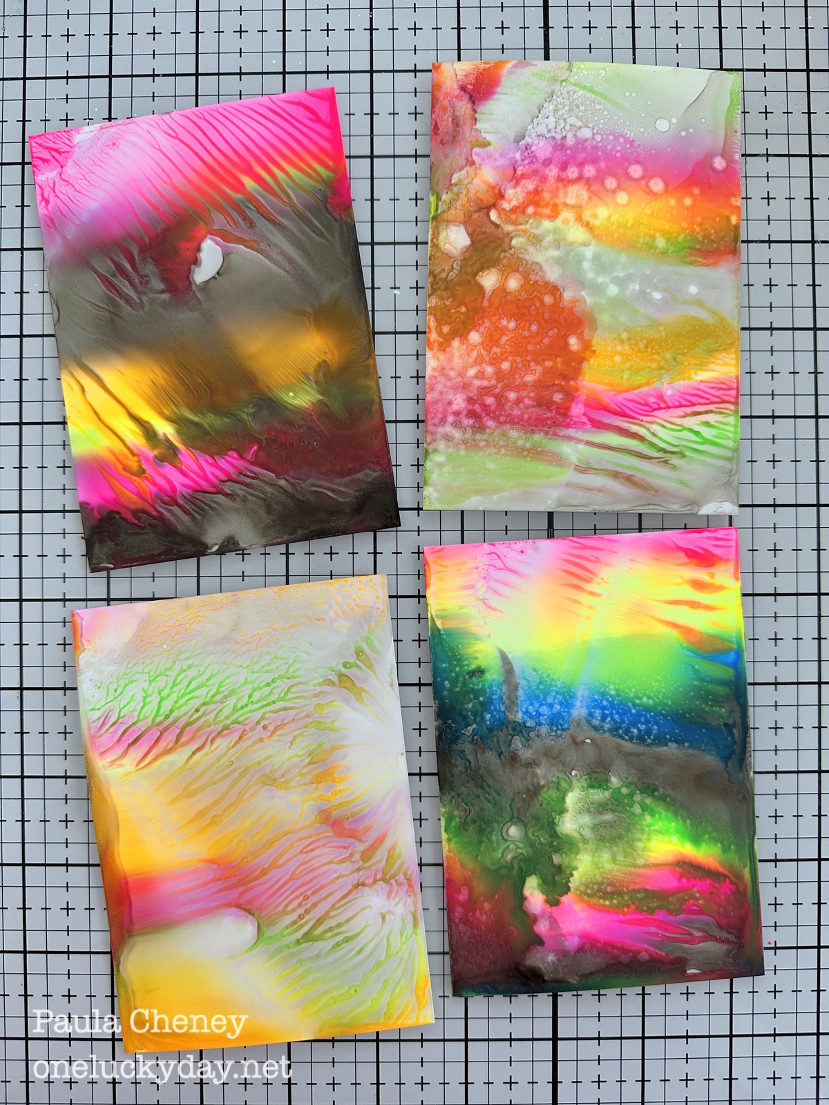
The colors are so fun but I really didn't know what to expect from a Neon - that is not in my regular wheelhouse. But look how my cards turned out! Aren't they amazing? 

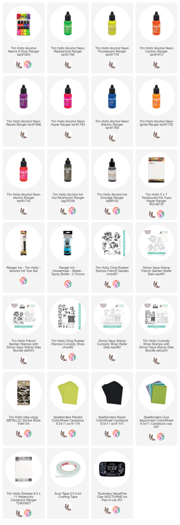
So lets gather the supplies you will need:
Yupo (5 x 7") - I cut each sheet in half to create twenty - 3.5 x 5" cards so I would have plenty to work with. This is the perfect size for a card front and this technique.
Alcohol Ink Neons (at least three colors)
Alcohol Ink Mushroom, Smudge
Alcohol Ink Tool set 
91% Isopropyl Alcohol in a small spray bottle (or even in a mini mister - one comes with the Tool Set)
Now lets talk about the technique I used to create the card fronts.  It's a simple one! 
Working on my glass Studio Mat (for easy clean-up with a spray of isopropyl), I created lines of color, including some of Smudge (which is not a Neon).
I did not photograph step two, which is to mist the Yupo with 91% Isopropyl Alcohol.
Immediately after misting, lay the Yupo into the ink.
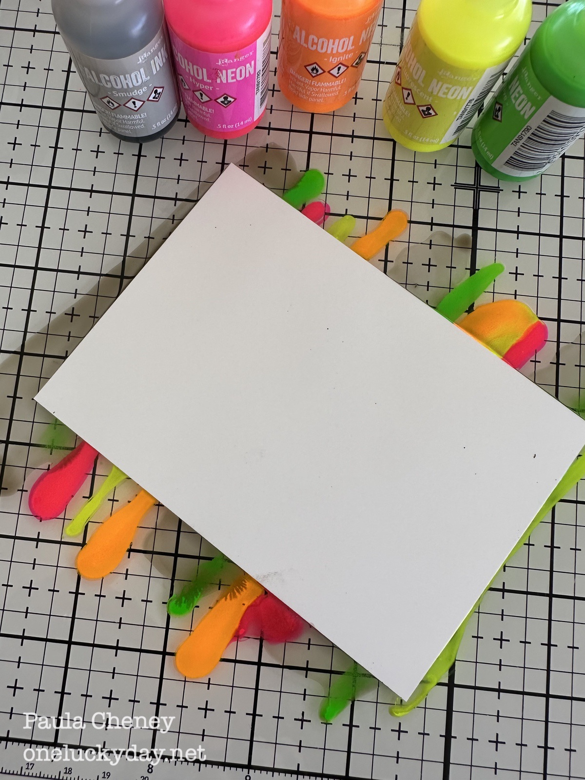
I moved the Yupo back and forth to get good coverage, then lifted it from the glass. The movement will create a suction effect with the glass surface so a small pair of tweezers can be helpful to lift the card from the glass.
Once I turned the Yupo over, I misted part of the surface with more Isopropyl (optional). You can also use the Mini Mister that comes with the Alcohol Ink Tools set because it gives you more of a fine mist rather that a spray, which can be hard to control.
So that is the basic technique - I just changed out the colors and the optional addition of Smudge. 
What about combining it with Mushroom instead of Smudge? This time I only used Hyper, Ignite and Florescent with the Mushroom for a totally different look.
What a wow with the contrast of the Mushroom! 
 The cool pattern at the top was created when I pulled the card from the glass.
Lets try another color combination. This time with added Radioactive (Green) and Electric (blue) added.
This one is very cool too! So even with 5 colors + Mushroom it looks good!
You might ask if you can use the excess ink. Well you can, but it will not be as good or true to color as the first pass through the ink. The ink does dry on the glass mat, so you have to spray with isopropyl to revive it. 
I chose 4 of my favorite backgrounds from the ones I made (it was very hard to stop) to use for the cards. Each are so different and I love that!
I used 1/2" Scor-tape to mount the Neon backgrounds on Watercolor Cardstock.
Then I added the front to a card backing made from Spellbinders ColorWheel Cardstock. This is 100lb cardstock so it is perfect for a card back (and it comes is a million colors!).
Even though I liked the cards as the are (those Neons speak for themselves), I decided to try something. What if I added a image to the center? Something like a flower that could be colored with the Neons? And did I have to use Yupo or could I use Watercolor Cardstock? 
So I used my favorite Nocturne ink (it is so BLACK!) and the a flower from the French Garden stamp to stamp on Watercolor Cardstock. Then I used the Simon Says Stamp French Garden dies to cut out the image.
Shake up any of the Neon colors and drip a bit out on the glass mat. Use a Alcohol ink brush to color the image.  These brushes are synthetic so they work with the Alcohol Ink. After use, just clean them with Isopropyl Alcohol instead of water. 
I did spray a tiny bit of Isopropyl Alcohol into the Neon Ink to thin it out. When the ink dried on the glass mat I can revive the ink with a spritz of the Isopropyl. You can decide if you want full strength Neons or a bit looser, both worked.
I initially thought the Neons might not work on the Watercolor Cardstock or that it might cover the black stamping, but it worked perfectly. As you can see the black ink is still perfect after painting. And the bold color comes through!
I love how the color 'Florescent' looks splattered over the 'Hyper' pink! 
Here are images of the final cards. I kept them very simple using the two stamp sets French Garden and Curiosity Shop, along with the coordinating dies from Simon Says Stamp.


Well, I for one was surprised how much I enjoyed myself playing with these new Neons! Honestly, they are so fun to work with! I hope you give them a go!
Now carry on,
Paula

Tuesday, June 10, 2025

Forget-me-not

Hello friends,

Today, I'm excited to share a project featuring Tim Holtz Palette Teal fabric from FreeSpirit. Teal is a personal favorite, and this collection did not disappoint — each fabric is absolutely gorgeous. The majority of the 10 Palette Teal designs exude a serene tranquility, but then you have 'Palette Teal Butterflies,' 'Tiles,' and 'Marble' which introduce more saturated tones. I blended both the calm and bold, incorporating pops of color from idea-ology ephemera to tie everything together. You might not immediately think orange pairs with teal, but it works perfectly here, right down to the vintage button stitched with red/orange thread. So enough talking, lets get started making!

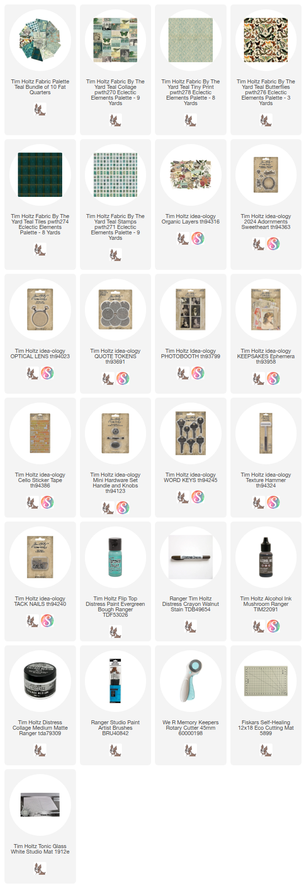
I used 5 of the 10 Palette Teal fabrics for this project. 
Teal Collage
Teal Tiny Print
Teal Stamps
Teal Tiles
Teal Butterflies
Teal Wallpaper
Teal Marble
Teal Ephemera
Teal Tickets
Teal Map


Paint the 9 x 9 Display Panel with Evergreen Bough Distress Paint. I wanted a more sheer coverage so I painted it on, then wiped off some of the paint. When the paint was dry, I sanded it with a large sanding block to reveal more of the wood. 
While the paint was drying (before sanding), I set work on the fabric background. I chose Teal Tiny Print for the background since it's subtle and it will work perfectly with all the other fabrics and ephemera. I cut a 9 x 9" square of both the Tiny Print and cotton batting.
Then stitched them together with a random pattern of straight stitches. Once the sewing was done, I cut the piece to fit the inside of the Display Panel.
So the panel and the fabric backing are ready to go!
I just added Collage Medium to the back of the Display Panel, then added the fabric into the back. 
TIP: cover the entire back of the tray with Collage Medium so the quilted fabric will be completely secured to the panel. You will be adding metals to the fabric and you do not want the backing to flop forward once the metal is glued in place (that would not be easy to fix).
Cut a piece of the Tiles fabric large enough so you can fold the sides under and iron flat. I colored a Photobooth image for the top and added it once I cut a "frame" into the fabric. Meaning, I cut a hole in the top tile so you could see the image like a frame. At first I didn't color the image, but I took it out and colored it with Distress Crayons to reinforce the teal and orange color scheme and it was so much better. Distress Crayons are magic!
I took the whole piece to the sewing machine and stitched around the outside. To get the clump of messy thread, I pull some thread from the machine, wad it up and stitch over it a few times. I use my fingertip to add watered down brown ink to color the thread before drying iwth my heat tool.
Next up is the metals. Each of these pieces was painted with white paint (either Distress or acrylic will work), then wiped away. Once dry, I added either more paint (like the blue on the key and blue and yellow on the flower). 
I also added Walnut Stain Distress Crayon to the Sweetheart Adornment and the flower (also from the Sweetheart pack).
For the Quote Token, I chose to keep it simple and just added Picket Fence Distress Crayon.
Add the Sweetheart adornment to the tile with Collage Medium. The Quote Token has two THIN 3D Foam Squares on the back. These will keep the Quote Token in place until it can be nailed to the wood panel.
Next up is the stamps. I stitched cotton batting and a block of stamps together. The fabric has a white background so I spritzed it with Antique Linen Spray Stain to give it an aged feel. I just spritzed and dried it with my heat tool.
Each of the three stamps were cut from the block, leaving the stitching only at the top. 
I spotted this piece of ephemera from the Keepsakes Ephemera pack that worked perfectly with the color scheme. I trimmed off the edges since there is a lot going on, I didn't need more distraction. I added a scene from the Collage Fabric to a piece of Watercolor Cardstock (because it's sturdy), then added it to the frame with Scor-tape.
For the ephemera on the bottom left, I created another stitched fabric piece with the Teal Collage fabric and cotton batting. I added more Watercolor Cardstock to the back of the ephemera piece (Keepsakes) then added it to the fabric with Collage Medium. This piece is long, so it's best to put something heavy on top while it dries so the ends don't turn up like a potato chip. Just saying...
Our last piece is the Optical Lens. I used the lens as a pattern to cut the circle of fabric from the fabulous Butterflies fabric. This was easy to do because I had painted the area I wanted to cut out with Collage Medium and let it dry before cutting. It makes the fabric just stiff enough to make the cutting easier.
I added a layer of Collage Medium over the top of the fabric and added it to the glass of the Optical Lens. 
Then I adhered the painted flower to the Lens with Collage Medium. Add enough glue to let the flower sit in it. Once dry, it will be super secure and ready to add to the Display Panel.
Putting it together -
After deciding on the placement, adhere each piece with Collage Medium.
I used the Texture Hammer to add a Tack Nail to the top of the Quote Token.
Once one side is complete, add the pieces to the right side. You can choose to use 3D foam Squares behind the Souvenir Views ephemera if you want it to be raised from the background like I did. The card with the bird is from the Layers Organic ephemera pack. I glued it with Collage Medium then added Cello Tape to the edges. The small key was added with Collage Medium. If you wish, you can choose to add another Tack Nail at the top of the key.
The buttons are all vintage. I collect buttons that have the thread left in, so all I had to do was glue these down with Collage Medium. Obviously, any buttons could be used and you could either stitch them right to the fabric backing or add faux stitching and glue them on like I did.
Once that section is complete, add the stitched piece to the left side. Again, I placed something heavy on top to make sure I got complete connection to the fabric below. Once secure, I added the vintage piece of ribbon and a tiny vintage button at the top. 

Finish off with more Cello Tape. That looks so good to me!
And the last piece is the Optical Lens. Again, use Collage Medium to secure it to the background.


I decided to add a handle to the top of the Display Panel. So I added a couple Screw Heads I had previously painted with white paint to the holes at each end of the handle. Once the glue had dried I just dripped one drop of Mushroom Alcohol Ink over the top. I also used a Walnut Stain Distress Crayon over the handle itself to add some aging.
I used Collage Medium to add the handle to the top of the Panel (of course I did that with the panel standing up).
And there you go. Done deal!
I couldn't be happier with this project. I love things collected - especially things that you might not think go together. I also know you could make this with with any of the Palette colors, but Teal just has a soft spot in my heart and maybe that's why this is so special to me.

Now carry on,
paula